











Colour Matching Grout
Choosing Grout Colours: The Stuff Nobody Tells You Until You’re Staring at Tiles and Panicking
Grout doesn’t sound exciting. Most people don’t think about it at all — until they realise the colour they picked has completely changed the mood of the room. Tiles do the big visual job, sure, but grout decides whether things look calm, busy, neat, messy, sharp, soft… the whole lot.
It’s one of those little decisions that makes you either very pleased with yourself or very annoyed every time you walk past the wall.
Here are a few things worth knowing before you pick a colour and hope for the best.

What Grout Actually Does (Visually, Not Just Practically)
The colour can either disappear or shout. There isn’t really a middle ground.
Sometimes you want grout to blend in so the tile itself carries the design; other times you want the lines to show because the layout is the interesting bit.
That’s basically the whole game.
If You Want Everything to Feel Seamless — Match the Grout
Matching grout keeps things quiet. It gives you:
- fewer visible lines
- a softer, more continuous feel
- a better sense of space in smaller rooms
Think marble, mosaics, or anything where the tile itself is the “wow.” Matching grout lets the tile have its moment.
If You Want to Show Off the Pattern — Contrast It
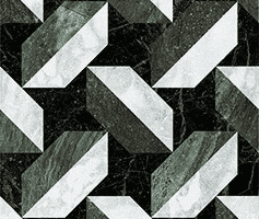
Strong tile shapes love contrasting grout. It makes the layout jump out a bit more — in a good way.
Classic example: white subway tile with dark grout. But it works for herringbone, chevron, geometric shapes, whatever you’ve got going on.
It adds structure and a bit of energy to the space.
Grout Decisions That Shape the Final Look
Tile Finish Matters More Than People Think
Glossy tiles highlight grout lines more than matt ones. Even if you don’t think they will — they always do.
So if your finish is shiny, a softer or matching grout colour usually behaves better.
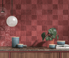
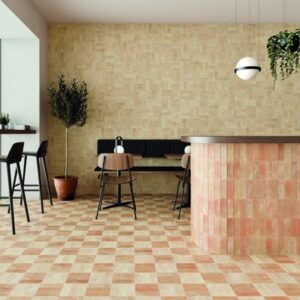
Textured tiles (like zellige, handmade clay, encaustic, etc.) already have their own variation happening, so they tend to look nicest with a grout shade that just quietly sits alongside them rather than fights for attention.
Test the Colour — Because It Will Not Look the Same When It Dries
Grout dries lighter. Pretty much always.
And lighting plays tricks — the colour can shift from wall to wall depending on whether the area gets daylight, warm evening bulbs or a mixture of both.
A tiny patch test saves a huge amount of regret later.
Neutrals Are the Safe Zone
If all the choices start merging into one, go for a grey or beige.
Not exciting, but very dependable.
They rarely clash, they don’t date quickly, and they keep the focus on the tile.
Feeling Bold? Try a Colour
Coloured grout can look brilliant when the tile is fairly neutral. It adds personality without taking over the whole room. Think soft sage with white tiles, or terracotta grout with warm stone — small decisions that make the space feel designed, not accidental.
At Architile, we work with Kerakoll’s library of 50 grout colours, which means you can get almost any shade you can imagine — from an exact match to a deliberate punch of contrast.
In Short
Grout isn’t complicated, but it is influential. Pick a shade that supports what you actually want the room to feel like — seamless, bold, calm, graphic, whatever your intention is. When the grout is right, everything else settles into place naturally.